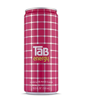
TaB Energy is a fruit, pink, low calorie energy drink created by the Coca-Cola Company to offer stylish young women the nergy to multitask. Turner Duckworth took up the challenge of reinventing this classic brand that had enjoyed popularity in the 1970 and 1980s. With the target audience in mind, it looked to the world of fashion to create an identity system based around a distinctive pattern more than a illusion in which dots seem to appear and disappear as you look at it, thus giving the structured design a distinctive expression of energy, supporting the brand promise: Fuel to be Fabulous. Optical vibrant patterns feature in a number of packaging concepts intended for this consumer group. Multicolored squares, referencing iconic 1960s Pop Art feature in Pop Ink's Repeat Engagement note cards. Mentholatum's Lip Ice is a range of flavoured lip balms popular with young Chinese market, Younggrace hair gels use bright funky colors and graphic shapes to reflect the differing strenghhs of the gels: a spalsh for water based, spiky for extra hold.
Reference:
Mark Hampshire, Keith Stephenson, DemoGraphics Packaging, Logos, Modena, 2007


