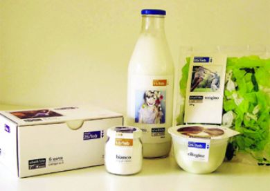
The project came from the need to simplify and optimise the communication of the life span of fresh food products, while simultaneously conveyng the concept of "short life span" as a positive value. "The best things in life don't last long ... we give them to to you every day". To emphasise the surplus value of shell life compared to best before date a line of products was created where the minimum best before date became a distinctive trademark and an element of different packaging typologies. As well as symplifying the structure of packaging, photography was used to metaphorically recall the concept of "short life" through a series of evocative images portraying delicate gesture and moments of beauty (a footprint in the sand, a sopa bubble, a butterfly, ecc). The shelf-life labeling associated whit a dominant colour identity a temporal category and specific range of products,making them easier to recognise and to store in a fridge in a domestic enviroment.
Reference:
V. Bucchetti, Packaging contro.verso, Edizioni Dativo, Milano 2009.


