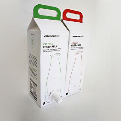
"I have designed a milk carton that highlights innovation, convenience and functionality in an effort to create sustainable milk packaging. It borrows the in-box bag concept that wine packaging has adopted. Having a tap fitment and a handle makes pouring easier. The carton has a gable top that is lengthened to form a handle that can hold 2 liters of milk. The design is strictlyaccording to Woolworths layouts. The carton has a pure clean white design to plainly represent fresh milk, but keeping a different color for different kinds of milk. Ihave used black for the Woolworths layout and information."
Reference:
http://ivanalilly.blogspot.it/2010/10/woolworths-2l-milk-packaging-2nd-place.html


