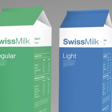
Work by Spanish artist and graphic designer Arantxa Reusmaking this milk packaging design based on the Swiss International Style. Great attention was paid to the use of colour and typography: the different types of milk are distinguished by the weight of the font. Thus, the whole is a bold, semi-skimmed is a regular and skimmed a light.
Reference:
http://arantxareus.com/ ; http://www.behance.net/gallery/Swiss- Milk/352070


