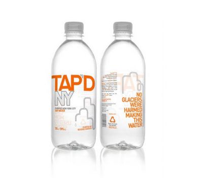
In 2007, Zucker had the idea for Tap'dNY when he realized that the water available on tap in his New York City apartment was great and could offer socially better solutions for bottled water. The name chosen was surprisingly honest, but what the company excelled in doing was to come up with a series of smart phrases imprinted on the bottles. They designed a clear bottle with a bright orange and white typeface. A water pipe denoted the cityscape. The design is clean yet contemporary and bold.
Reference:
http://tapdny.com


