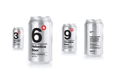
A beer package design. The task was to create a package design using typography only. It was decided to create a package of swiss beer from Helvetica province brewery. So the font choice was pretty obvious.
The large digit tells us about an alcohol percentage of the beer, and the can color tells about a beer kind - lager or stout. Important customer information is in the focus, while the small logo is placed in the corner.
Reference:
http://www.behance.net/gallery/Helvetica-beer/6549003


