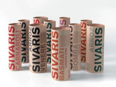
The aim of these packages was twofold: to raise products awareness and profile, and to do so with a simple and clear apparence.
To achieve these goals, the graphic design is based exclusively on typography and color to distinguish the different varieties of rice. The packs are made with tubes and lids already existing in the marketplace, while the graphics are laser printed on kraft paper labels which are then adhered to the tube.
Reference:
L. Badalucco, Il buon packaging, Edizioni Dativo, Milano, 2011


