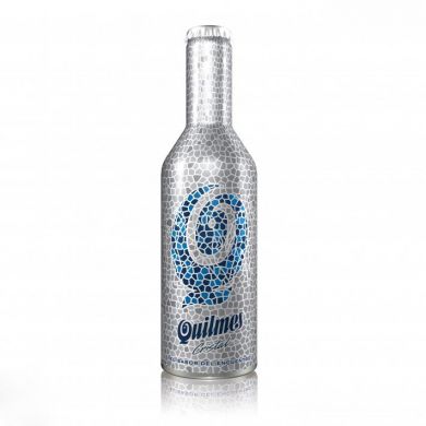
This packaging changes its graphic under an ultraviolet light, when the "spirits of fun" appear. The ghaphic proposal consisted on covering, with a texture of little silver mosaics, the body of the bottle. The coldness of the material was counteracted and its lightness was taken to the extreme. These mosaics alter the chromatic palette in the central part creating, with different blues, the letter “Q”, synthesis of the beer logo. The ink used imposed that no other ink can touch it. This limitation was overcome thanks to the “kaleidoscope” design; its internal lines form the silhouettes.
Reference:
http://www.salonedeldesigner.com/design.php?ID=25096, http://www.adesignaward.com/design.php?ID=25096


