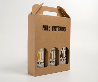
From Mads Jacob Pulsen's website:
“The identity for micro-brewery Ribe Bryghus should have characteristics which felt like the beer; handmade and full of taste. The result is the logo and beer-labels made with a custom typeface in colors according to the content. The look and feel is contemporary and classic at the same time with the simple use of typography and colors. The ingredients-list, bar code ant other information is placed on the left and right sides of the label in order to be “invisible” from the front.”
Reference:
http://www.madsjakobpoulsen.dk/?work=ribe-micro-brewery


