From Andrew cewzo blog:
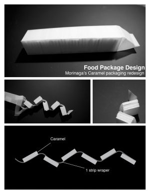
"This food packaging design for Morinaga Caramel was from this semester's "memory" project. The goal for this design was to use less materials. The pictures that you see above are the prototypes. The original design of morinaga caramel has a big paper box; in side the paper box there are 12 individually wrapped caramels. In other words, 12 caramels, 12 wrappers. So when I first started thinking about the design, I thought about how to eliminate this excessive use of material. In the end I decided to use a stacking method that changes the wrapper to one long piece of paper, so that the use of material is much reduced.
Morinaga always had a very unique packaging to their products, therefore this was also considered when redesigning the packaging. The long paper box mimics a milk box. Also, the box was designed so that adhesive is only needed for once."


